
STRAVA GLOBAL MENU REDESIGN
Improving Navigation and Feature Use Through User-Centered Research and Interaction Design
Strava is freemium social network for tracking and sharing physical exercises, with a feature-rich website and mobile application. My teammate and I utilized questionnaires, user interviews, card sorting, design preference, and prototype testing to discover and design improvements for some of the problems our participants helped to identify in the Strava mobile app interface.
PROJECT OVERVIEW
Timeline
January 2021 - May 2021
Project Type
Mobile App Interface - Global Navigation Menu Redesign
(Graduate Project)
Team
UX Research & Design - Adam Wolf
UX Research & Design - Atishi Batra
Key Responsibilities
User interviews, asynchronous questionnaire, design preference testing, contextual observation and inquiry, card sorting, data analysis, prototyping, usability testing, iteration, high fidelity interface designs, presentation of findings and design process
CUT TO THE CHASE (TL;DR)
If you're already familiar with Strava or just want to skip to the fun part, the final results of our user research and design can be summarized as such: through user interviews and card sorting, among other methods, we discovered that the Strava mobile app has a confusing, distributed interface that makes many of its features difficult to discover or use effectively. Some features are only available on desktop, some are buried in two or three layers of other menus, or even in the app settings, and our users would like easier access.
We propose the following solution - an expanding global navigation menu sidebar which would present the user with those features identified by Strava users as being the most important or useful, and a search functionality to help them find other features buried within the current user interface.

Figure 1
Figure 2
Figure 3
In the final iteration of our design, the global navigation menu pulls out to the right from the minimized line on the left (Fig. 1), the quick access menu provides the most-used features (Fig. 2), and the fully expanded menu shows additional features and a search bar (Fig. 3).
*Note: Shortly after we completed this project, the Strava team released an update that may have affected some of the features or interface elements described herein. However, our design solution is still relevant as many of the problems we discovered in our research insights still exist in the app's current iteration.
THE PROBLEM
Strava's users can track various activities like bike rides, runs, and hikes, gain achievements and notoriety, and share their activities with others for "kudos" and encouragement.
There are, however, many other features available for users to track, analyze, and compare their stats with their own previous attempts and the activities of others. So many other features, in fact, that none of the users we interviewed were familiar with all of them. Some features are also device-specific, requiring either a computer or mobile device to use or edit.

The Strava web portal, showing just a few of the available features.
Through interviews and questionnaires my partner and I discovered a variety of different design opportunities within the Strava ecosystem:
Opportunities for improvement of existing UI:
-
Auto recognition of start/end and pause/resumption of workouts
-
Bring hidden features to the forefront
-
Route creation and navigation
-
Full functionality on mobile devices
Design opportunities for new features:
-
An integrated dashboard for all fitness needs
-
Conversion of miles into real-world rewards
-
Personalized training with an AI coach
-
Adaptable UI for outdoor workout conditions
OVERVIEW: GOALS & CONSTRAINTS
Faced with a plethora of design opportunities after analyzing our participants' responses, and given the time constraints we were facing, we decided to narrow our scope considerably.
For the purpose of this project, our goals focus primarily on providing users with a global navigation menu which provides quick, intuitive access to features that are often hidden, buried in various submenus. We chose to focus on increasing awareness and use of features, making access to all features easier by providing a centralized global navigation menu. We also found in our analysis that Strava users commonly wished for mobile app access to features that are currently only available via web browser.

During our design and iteration phases we had to keep the project constraints in mind. The massive number of features makes it difficult to organize them all visually in a menu together. Some features may be online-only due to the need for greater resources than mobile devices can be relied upon to provide. And finally, not all features are available to every user, being locked behind a paid subscription.
CARD SORTING

After our initial interviews and questionnaires were coded, analyzed, and discussed for useful design opportunities, we reached back out to some of our earlier participants to conduct a hybrid card sort of the available features using the Optimal Workshop tool. We also conducted a pre-sort questionnaire and a post-sort interview to clarify our observations.
Our goal was to identify the more popular (and rarely used) features to assist in placement in a revised menu system. We observed the card sorting process while our participants categorized, grouped, and prioritized 50 of Strava's most used features presented in random order. Our participants consisted of four paying Strava members and two members who use the free services.
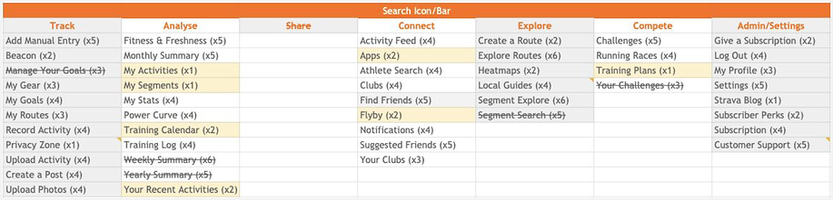
The results of our card sort can be seen above. Based on the findings removed some redundant features or features that could live together in one location, changed several feature names based on post-sort interview questions where our participants expressed confusion in response to unintuitive feature naming, and organized the remaining features by order of participant placement. These insights became the basis for our expanded global navigation menu design.
FINDINGS AND KEY TAKEAWAYS
Takeaway Theme 1: The Strava app is feature-rich but hides many of its more useful features behind a labyrinthine user interface.
Recommendation 1: Redesign aspects of the Strava app's menu system to more clearly promote previously hidden or difficult-to-access features.
Takeaway Theme 2: Certain web-only features are strongly desired in the functionality of the mobile app.
Recommendation 2: Add web-only features to the app where possible, or make them seamlessly accessible from mobile devices (such as linking directly to the browser from within the app, where necessary).
Takeaway Theme 3: Among our research participants, the social media aspects of Strava were found to be less important than the tracking and analysis of their own fitness trends and data.
Recommendation 3: Redesign the mobile dashboard to maximize usability with regard to self-tracking.
MENU CONCEPT PREFERENCE TESTING

Takeaway Theme 1: Feedback from preference testing participants indicates that too many available features combined with larger graphics can make the side menu interface feel too cluttered.
Recommendation 1: Use reduced icons instead of large background graphics and cut back on the feature list.
Takeaway Theme 2: Participant preferences were closely split between the minimal (Figure 2) and first maximal (Figure 3) menu designs.
Recommendation 2: Combine the two menus into a quick access menu that can expand out to two full columns of the most important features to users as indicated in the card sort.
Takeaway Theme 3: Strava's current search functionality only searches for friends and athletes. Research participants appreciated the incorporation of a search bar in the menu that would allow them to search among features and clubs in addition to finding social contacts.
Recommendation 3: Move the search functionality to the expanded menu and provide greater affordance by allowing it to search beyond friends and athletes.
Our first set of concept prototype variations. Figure 1 shows the minimized pull tab on the left side of the screen. Figures 2, 3, and 4 are all potential individual menus in this iteration of the design. Figure 2 shows only the most important features identified in our user testing, whereas Figures 3 and 4 are variations on a more comprehensive list of features, as categorized and organized by users in our card sorting exercise.
At this point in the process we conducted a preference test in Usability Hub, asking participants to select only one of the expanded menu options seen above, followed by a brief interview where we ascertained the reasons behind their choices.
DASHBOARD REDESIGN
In addition to the menu design, we utilized user feedback from our initial interviews, questionnaires, and card sort to inform our redesign of the Strava landing page.

As can be seen in the callouts above, we removed interface elements that could be better contained within our sidebar concept, changed the bottom nav to reflect user preferences, and changed the feed to focus more on personal statistics followed by the social media stream.
CONCEPT ITERATION
These iterations took into account insights and findings from preference testing and follow up interviews.

Most notably, we combined our previous menu concepts using the original minimal menu and a redesigned, expanding maximal menu. We replaced the larger graphics with icons and removed the dividing lines in the maximal menu. We also reduced the listed features according to results of the card sort, to prevent the menu from becoming too cluttered, and improved the functionality of the search bar.
USABILITY TESTING IN ADOBE XD
We conducted a final usability test of our designs and iterations before the deadline, both to get an idea of which aspects were a definite improvement on the original design and to ideate for future consideration.
-
Participants were asked to complete simple tasks to explore the new menu system, global navigation, and landing page redesign
-
Post-observation questions included their thoughts on the design and if anything felt missing or broken to them as regular Strava users

FINDINGS AND FUTURE WORK
Based on usability testing, the revised landing page is determined to be an improvement by all participants. Quick access to personal statistics and settings are deemed very useful, movement away from social media feed is appreciated.
The global navigation menu is highly regarded in usability testing. Participants felt that the expanding menu was effective for providing access to previously hidden features and that the quick access menu would be an efficient and intuitive way to access frequently used features.
Area for improvement: The transition from quick access to the maximized menu was found to be unintuitive, and participants had to be guided to that functionality. Our recommendation would be to clarify that affordance in the design of the menu tab or side bar, making it clear that the quick access menu does expand out to a larger menu and that it can also minimize back to the landing page.
FINAL MENU ITERATION
In this cleaned up final mockup, the menu drags out from the minimized line on the left, the quick access menu provides the most-used features in the middle, and the fully expanded menu shows additional features and a search bar on the right.

UX Designer & Researcher / UI Designer

UX Designer & Researcher / UI Designer